Donut Break Website
VISUAL DESIGN | UX/WEB STRATEGY | BRAND IDENTITY
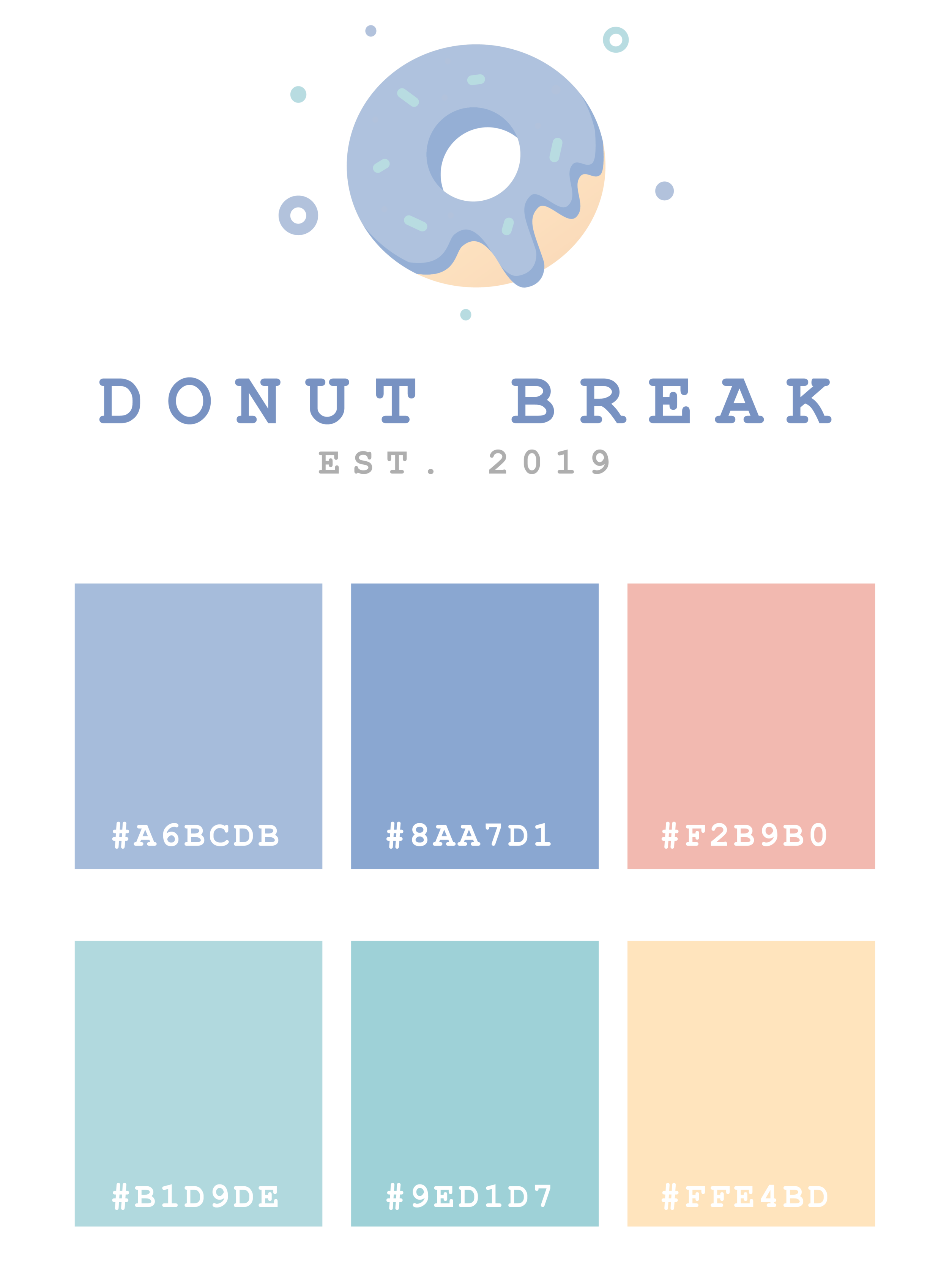
Donut Break is a conceptual gourmet bakery specializing in creative, boutique donuts. Baking unique, seasonal flavors, the Donut Break team brings an artisanal approach to donuts, which can be seen in the creativity and passion poured into not only their unique donuts, but also into every detail of their brick and mortar stores.
MY ROLE:
Branding & Visual Design
Web Design
UX
THE CHALLENGE:
Wanting a clean, modern and energetic brand, I focused in on what was really important to the client: the product!
Starting with identifying what the key principles and values surrounding the brand, we singled out the items that we felt were the most significant. Creating a light, carefree brand that inspires viewers to convert was the key goal. Paired with thoughtful, user-centric actions throughout the site design makes this website a user-friendly and intuitive experience.
A F F I N I T Y M A P P I N G
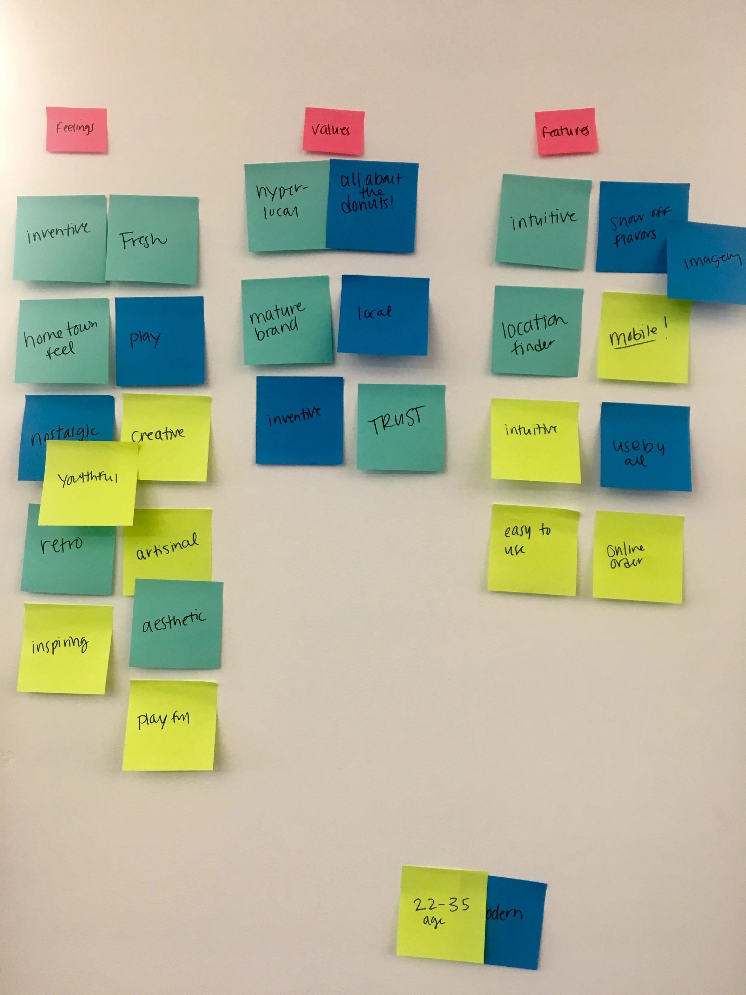
The affinity mapping exercise helped us gather up the large amounts of data we collected, ranging in emotional reactions, aesthetic desires, and business needs, in order to create logical groupings or themes based on their relationships. Once we could see everything we wanted to accomplish in one place, it was easy to group items together to help shape the direction of the navigation and flow of the site.
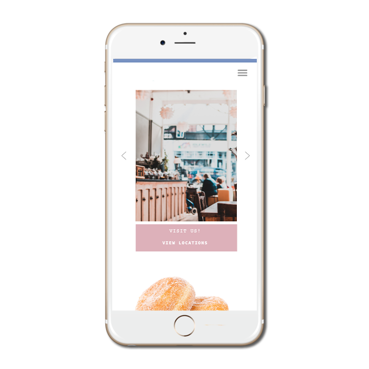
Once the major groups were identified and target personas were assigned, we moved into the competitive research stage. One thing we KNEW we wanted to keep in mind, was designing for mobile-first. The majority of people seeking this product out, are on-the-go. We wanted to make sure mobile was our #1 priority when designing.
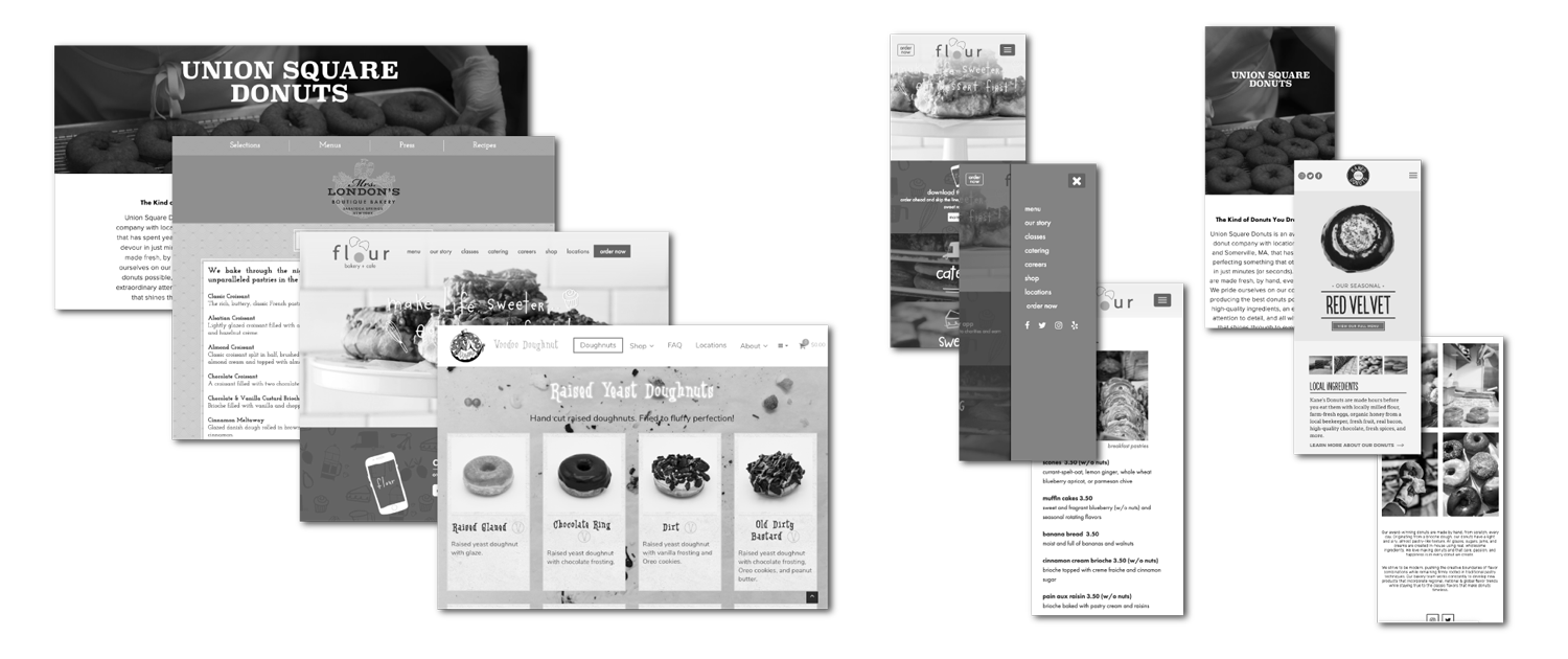
COMPETITIVE RESEARCH:
There are a lot of bakery/ donut/ cafe businesses to gather inspiration from. I focused on some direct donut competitors: Union Square Donuts, Voodoo Donuts, and Kane’s Donuts, as well as some indirect, but related competitors: Flour, Mrs. London’s Bakery, and Bagelsaurus.
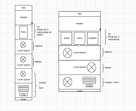
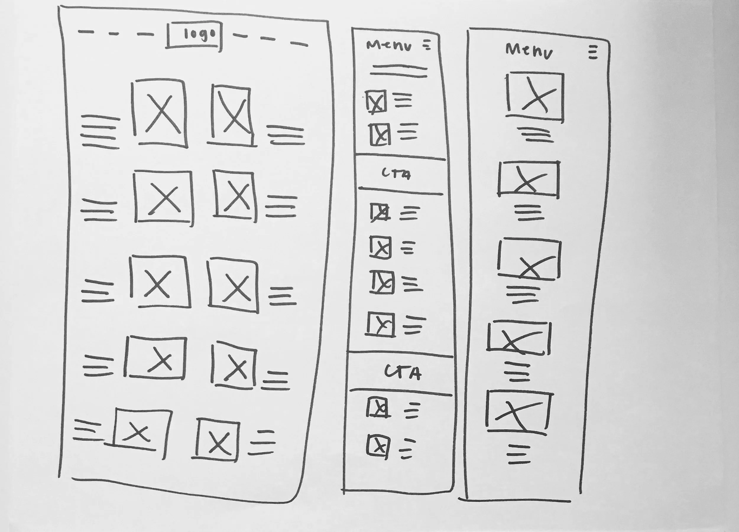
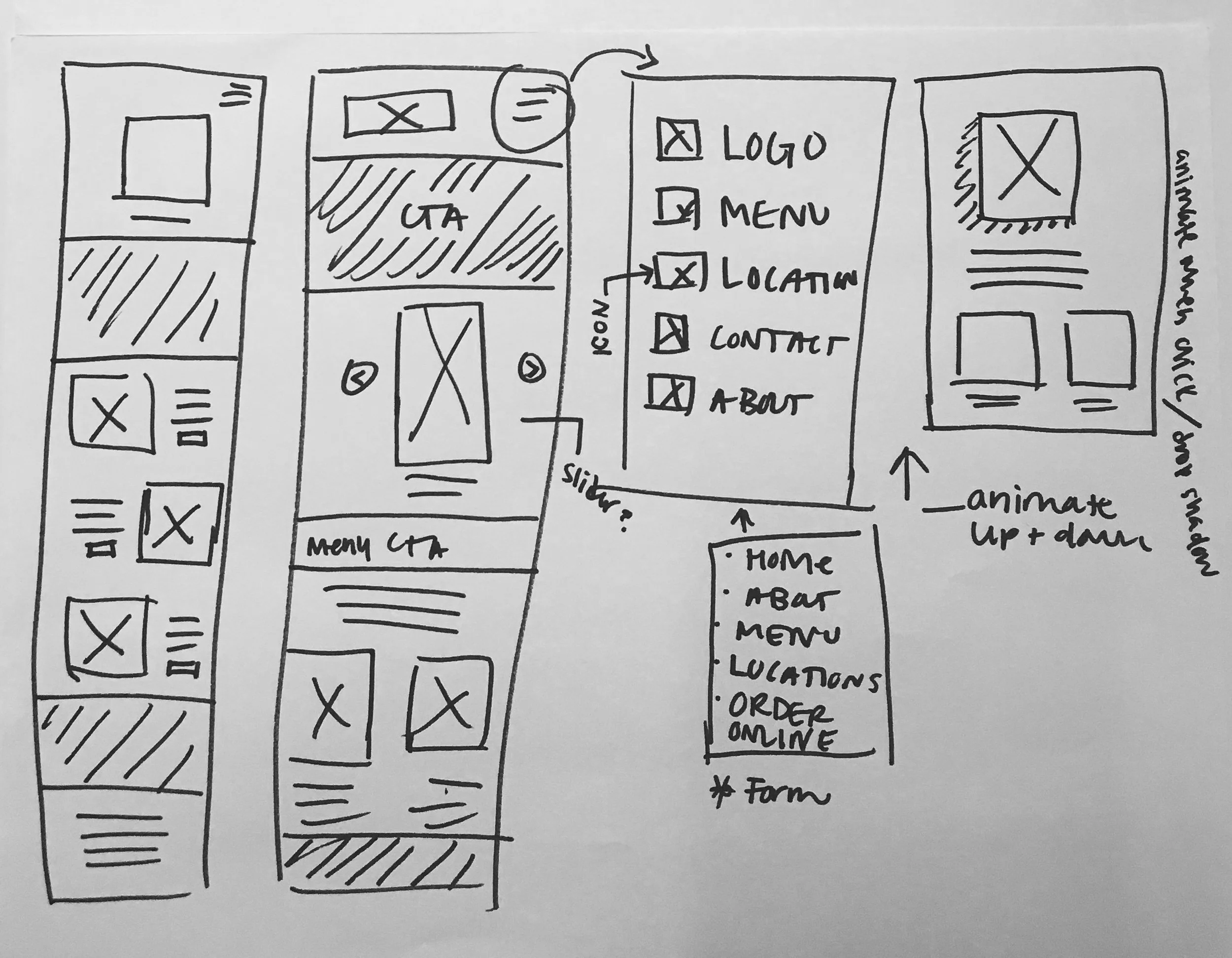
CONTENT MAPPING & WIREFRAMES:
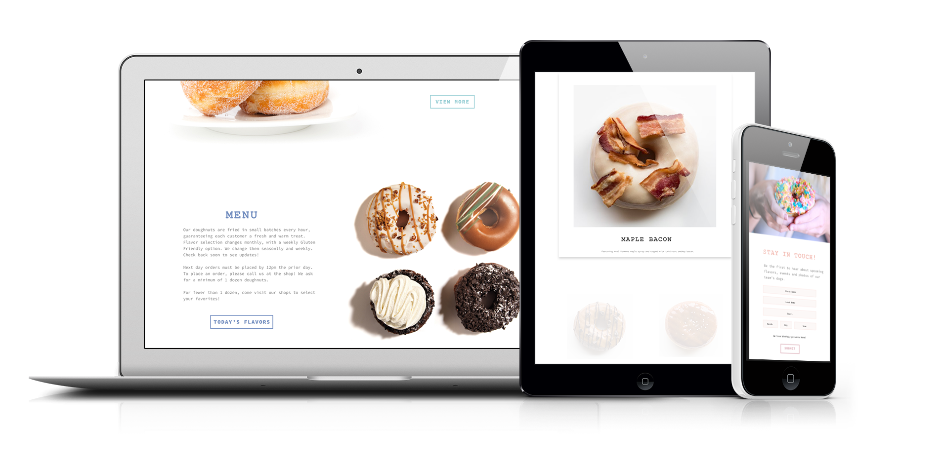
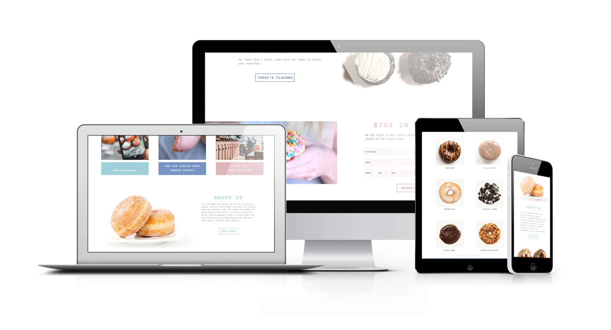
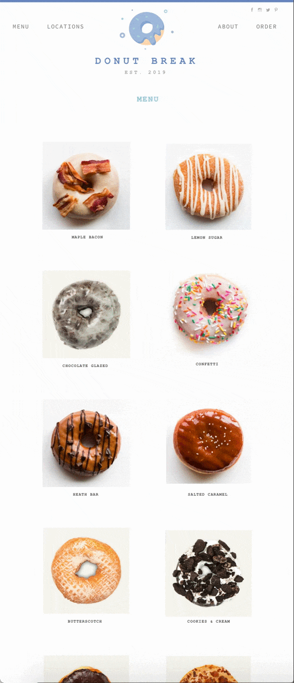
Aligning with the key principles we initially developed, 1. focus on the product, 2. intuitive user decision-making, and 3. memorable experiences, we moved forward with those big three in mind. It was important to establish a clear user flow and keep all aspects of this project in mind. After doing some user testing, we found the majority of users went to two places: “Menu” (overwhelmingly this was the first stop) followed by “Locations”. Breaking that down that data, and designing for that, helped us to focus on the true needs of the users.
FINAL DESIGN:
Using primarily Lucidchart and Adobe XD, I moved from the wireframe to the final design, designing always for mobile-first. Once I established core layouts, I added visual design elements and added the steps of my user flow. The user experience is always top of mind. Ensuring the user is navigating the site properly is something we will continue to test and track as the site is pushed out from development.