CloudHealth by VMware Website Redesign
DRUPAL CMS MIGRATION | WEB STRATEGY | UX/UI
OVERVIEW:
CloudHealth by VMware is the leading SaaS multicloud management platform, managing $15B in cloud spend with 10,000+ customers globally. The website is the most visual representation of the brand and although the company had grown dramatically in maturity and scale, the backend of our website had remained virtually untouched since its initial launch in 2016. We had a technical need to migrate from D7 to D8, so we took advantage of this opportunity to also reimagine the site from the ground up to optimize our B2B lead generation efforts. As the CloudHealth brand manager and UX web designer, I led creative strategy from end-to-end and worked cross-functionally to deliver a best-in-class web experience.
This project received recognition at the 2020 Acquia Engage Awards, winning “Leader of the Pack, Technology”. The website launched in July 2020.
MY ROLE:
Creative Direction
Competitive & User Research
Visual Asset Creation
Prototyping & Testing
Drupal Quality Assurance and Reporting
Project Management
TOOLS USED:
Drupal / Acquia
Adobe XD
Adobe Illustrator
Adobe Photoshop
Crazy Egg Web Analytics
Google Analytics
JIRA / Slack
THE TEAM:
Content Specialists
Sr. Web Manager
Graphic Designer
Development Agency
THE PROCESS:
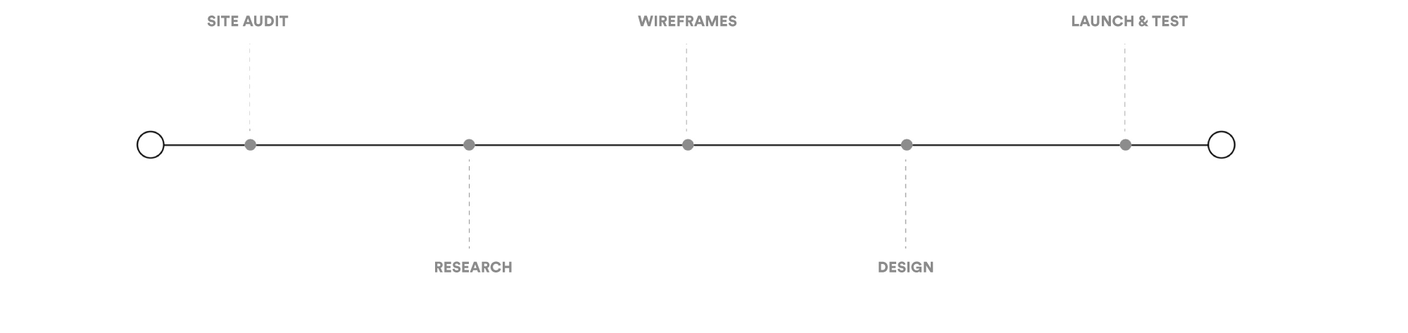
SITE AUDIT:
The first step to the redesign process was performing a site audit for both design and content. I worked closely with our content writers and developers to review both the way the site is organized and the messaging we were communicating to prospects before strategizing together on ways to improve
Additionally, we took this time to review all of our brand's visual assets; from emails and webpages to our iconography and social media presence, flagging areas where we could be more tightly aligned and identifying key places of opportunity.
RESEARCH:
We took this opportunity to start from scratch and began by examining the site as whole, identifying areas where we were currently exceeding expectations and flagging where we were falling short. We also took a deep dive into places where we thought our competitors were successful and began to gain momentum around how we aimed to restructure our site’s user experience.
We took this opportunity to really start from scratch in how we thought about the site as a whole and examined areas we were currently exceeding expectations and places where we were falling short. We took a deep dive into places where we thought our competitors were successful and began to gain momentum around how we aimed to restructure our site’s user experience.
We mapped out dozens of user flows and from here, we created a “wish list” for the next phase of the CloudHealth website. Our wish list quickly transitioned into a spreadsheet full of actionable features, layouts, and documented hundreds of interesting moments we’d experienced while conducting research.
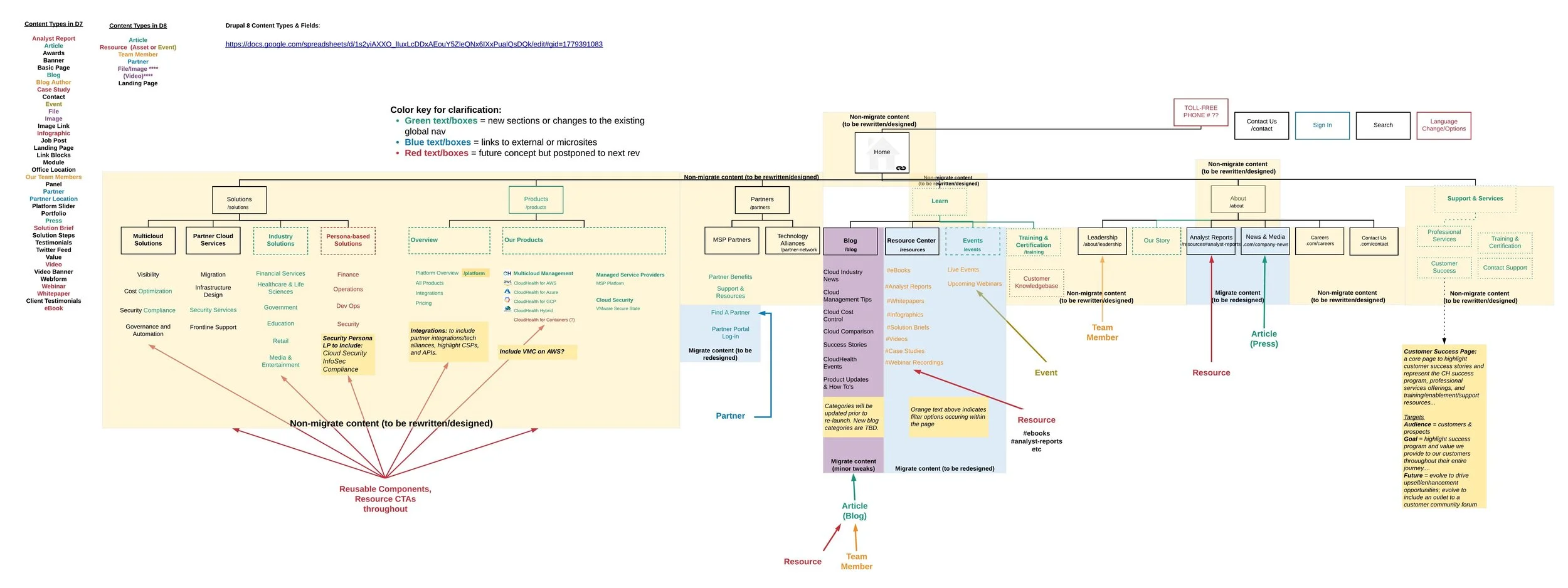
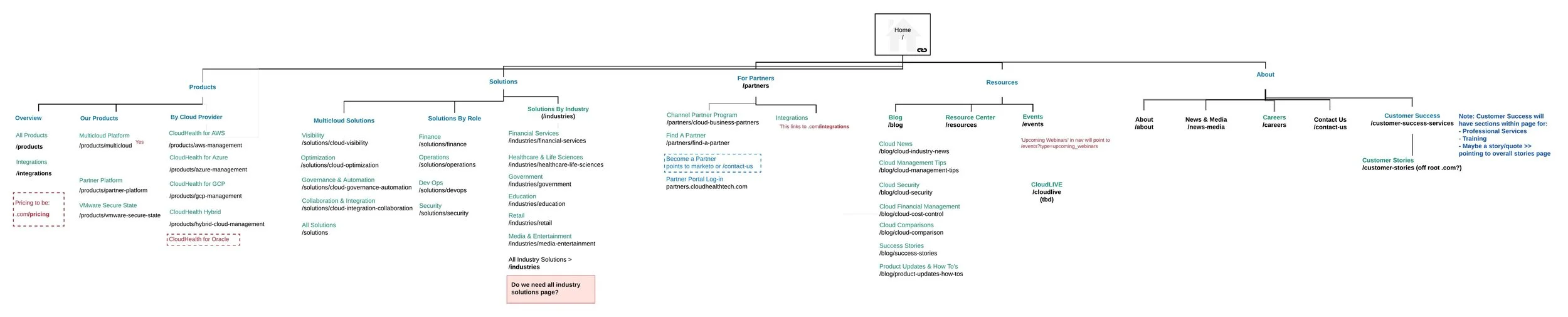
INFORMATION ARCHITECTURE:
Next, we met with product stakeholders, sales leadership, and got insights from CloudHealth users. We used the product roadmap as a guiding light as to how we would structure the new Information Architecture, making sure to highlight the core functionality and budgeting space for future initiatives, like internationalization and upcoming product launches.
CloudHealth is unique in that we have direct users, in addition to a thriving partner community with customers leveraging the CH platform via a third-party partner. Our old IA was not built to scale, with large tiles that were virtually “filled up” upon launch. The old IA did not account for different user paths but instead tried to force all users down the same funnel, and althrough the CloudHealth app contains hundreds of interesting features, we only had one product page. All of these were core areas for improvement as we moved forward.
With our newly proposed IA, we developed a solution-based path, a product-based path, and an industry-based path. This way, we could cast a wider net with how prospects thought about the business outcomes that come with the CloudHealth solution. Additionally we aimed to redesign core areas of SEO traffic - the blog and the resource center. Up to this point, our content team had worked miracles with what we could do, but still left us with a lot of room for opportunity with this restructure.
WIREFRAMES:
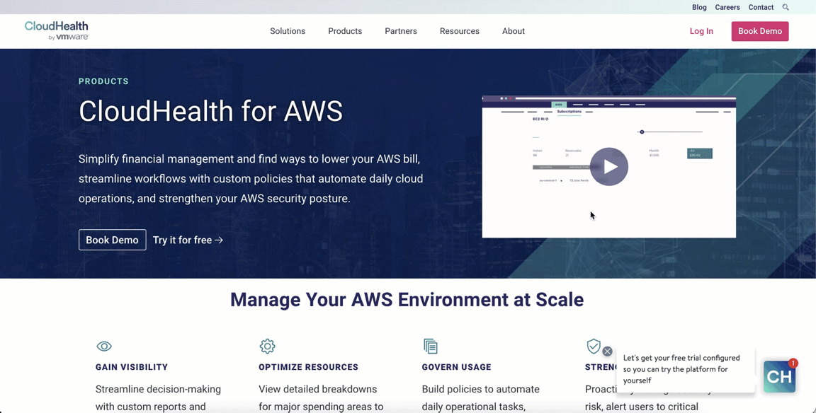
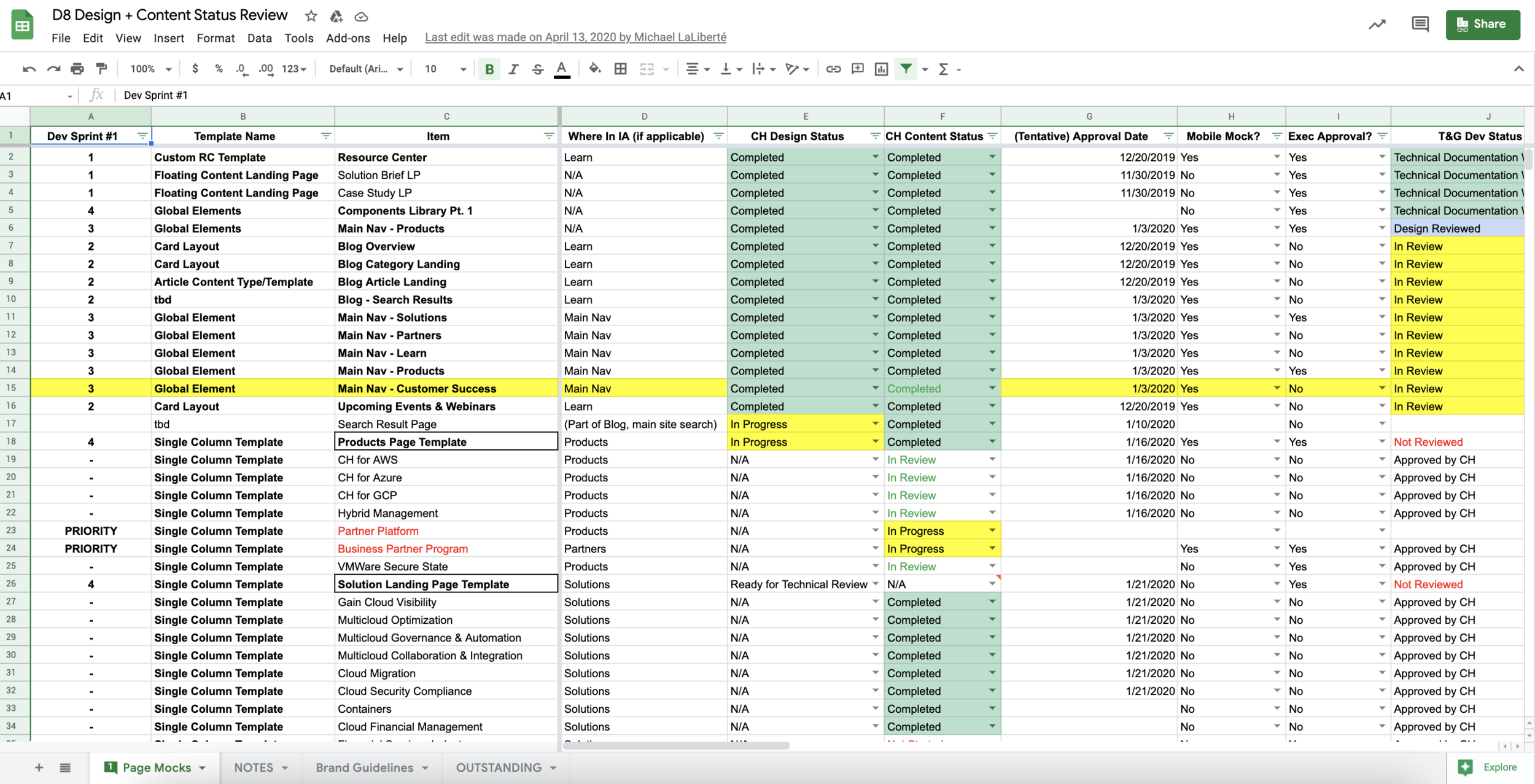
Once we nailed down our new IA, the next phrase was identifying lose wireframes for our key pages. From this, I developed a design system of individual components that we could use to support varying layouts, content/ product needs, and provided us the flexibility we were severely lacking in the Drupal 7 site. During wireframing, I focused on several areas of improvement. Our current site was very static and the structure it was built on didn’t allow our marketing team to be as flexible or agile as we needed to be. The back-end consisted of Drupal panels stacked on each other, making it nearly impossible to create a dynamic page layout. Additionally, when the site was built, mobile was not a key consideration. After reviewing mobile site traffic, we knew it was crucial to approach the project with a mobile-first design lens. We took our proposed designs to the executive leadership team, pitched our vision and began work, partnering with our web development agency.
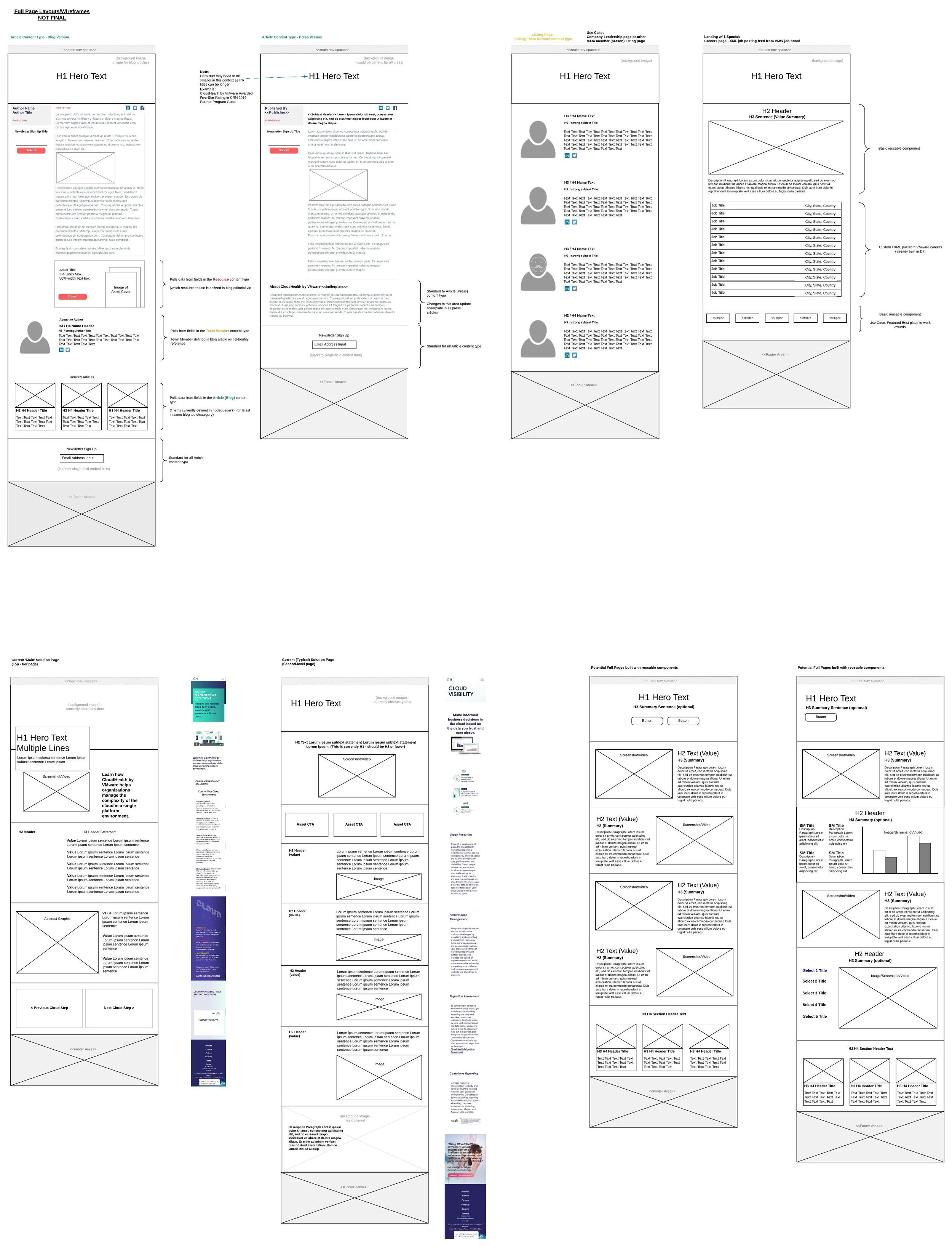
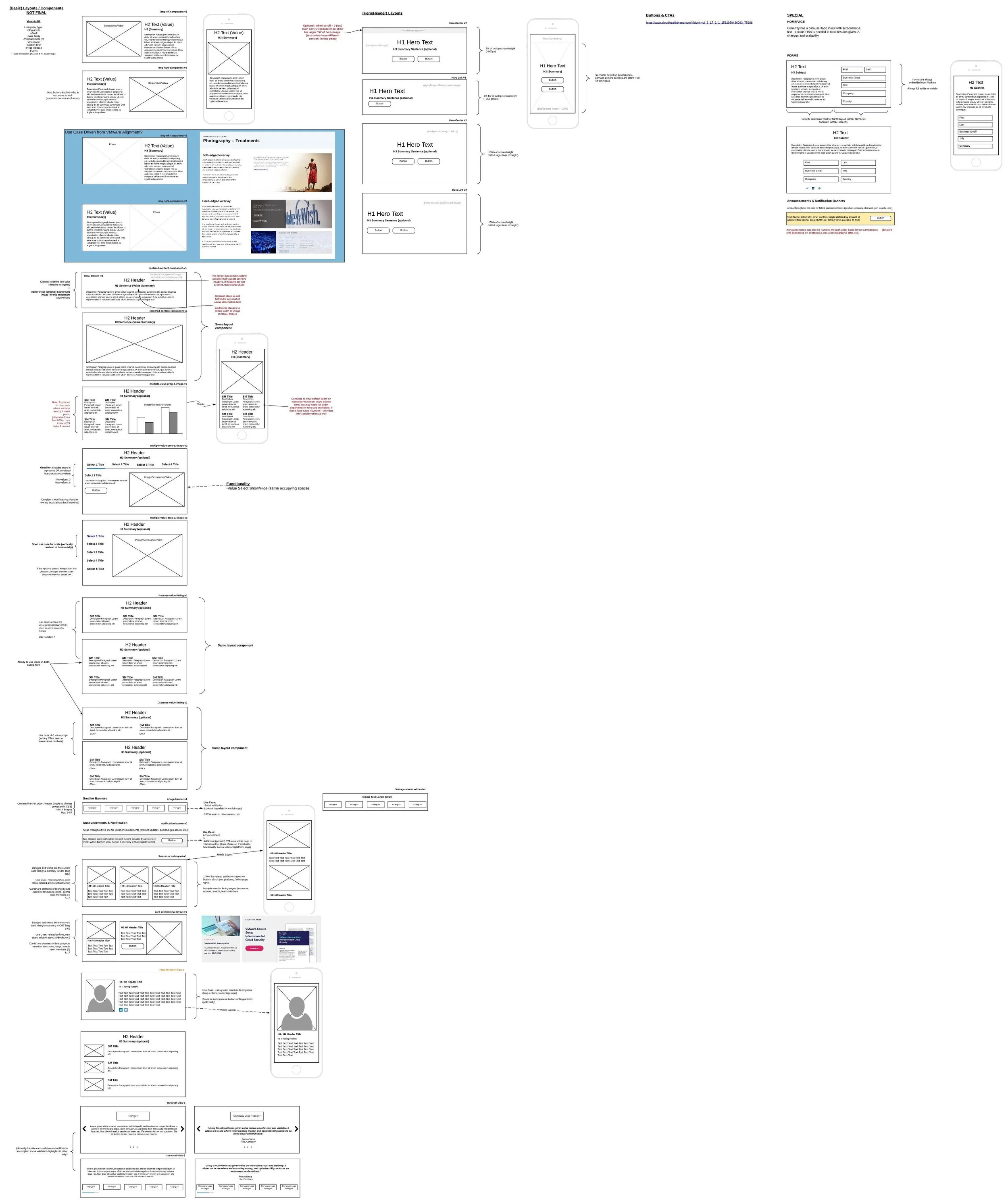
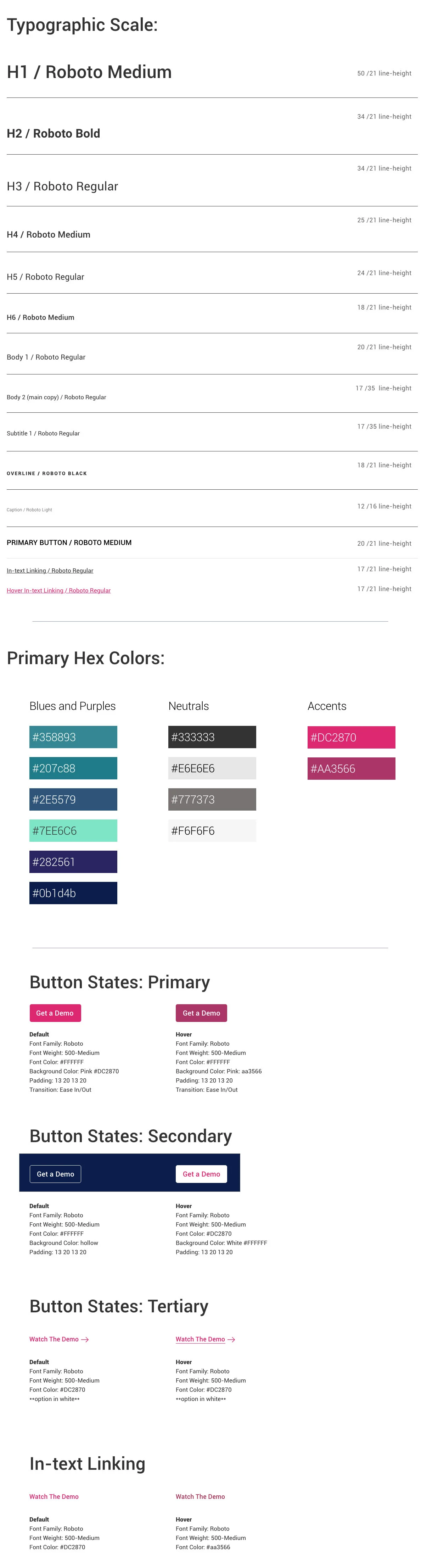
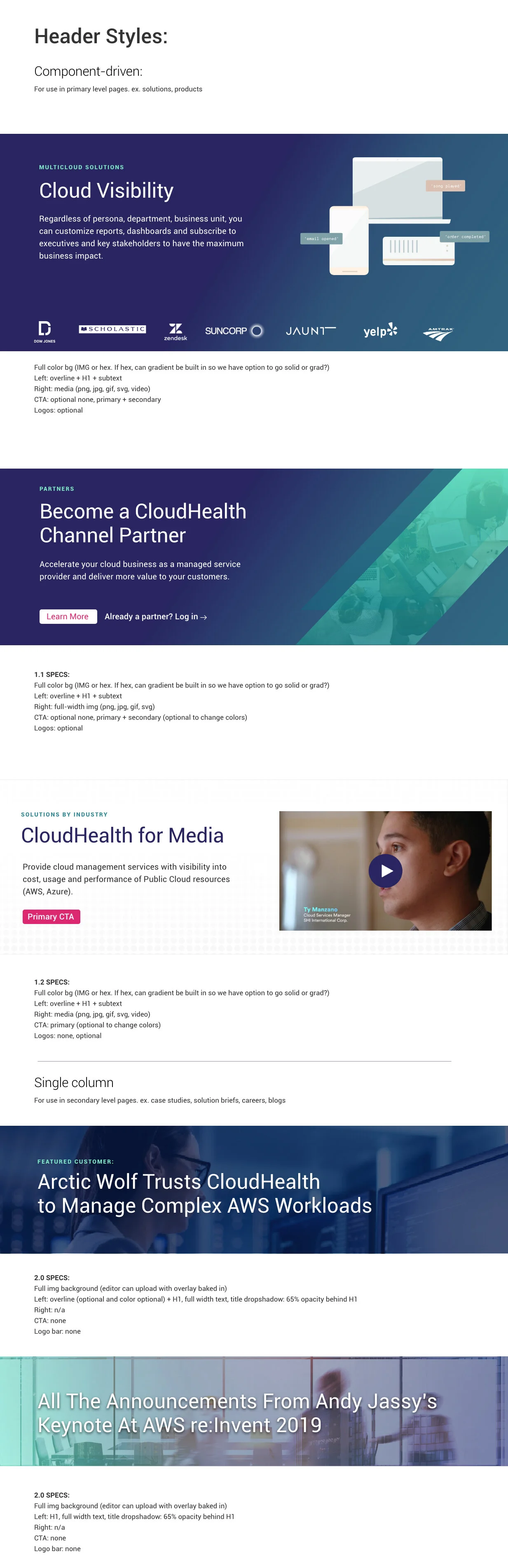
Sample of Drupal Components and Type Scale:
LAUNCH & TESTING:
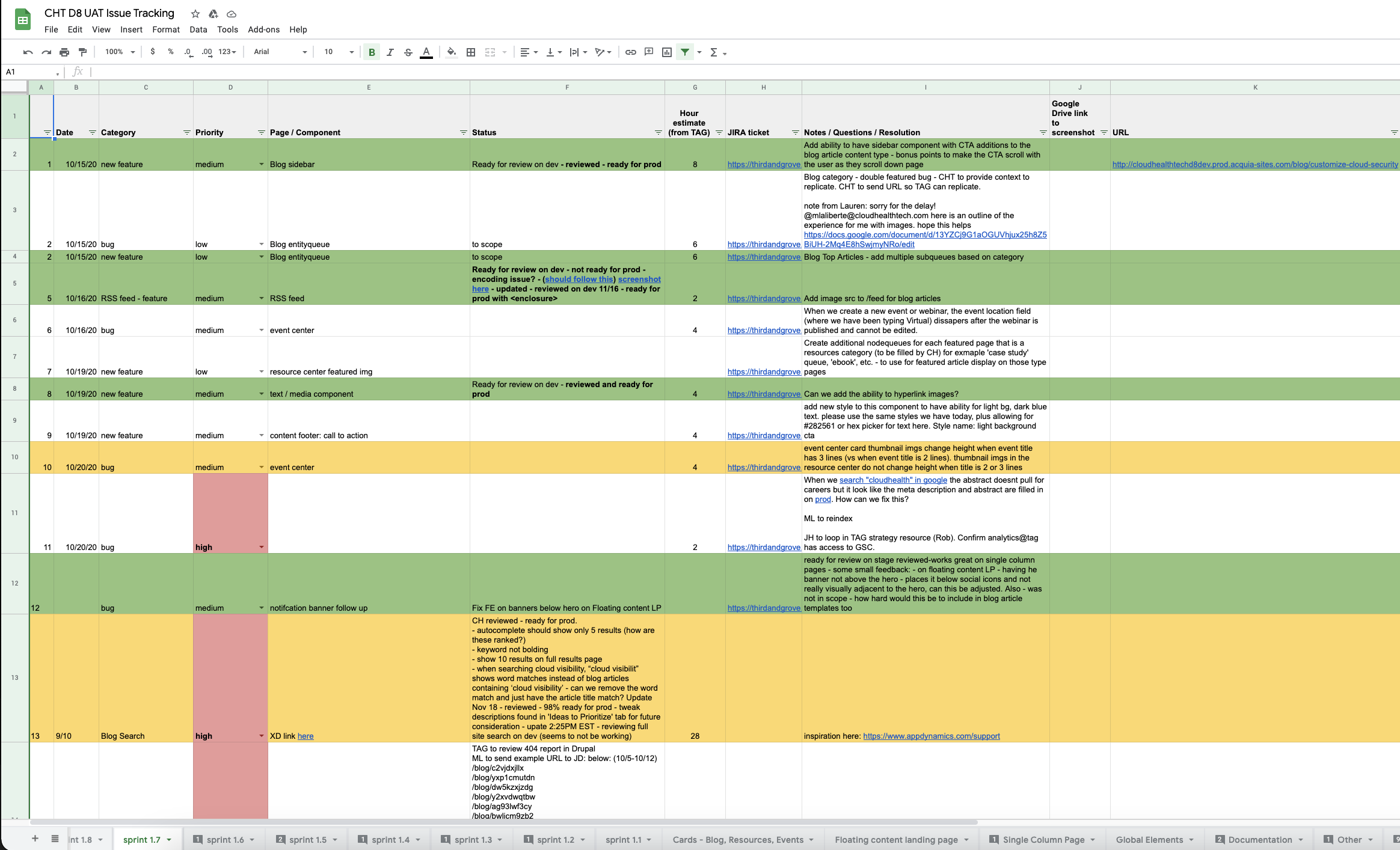
We worked in sprints to develop a workflow building out vision to life over the course of 8 months, with a launch date in June 2020. We hit a few bumps in the road with the COVID-19 pandemic and changes to our global GTM strategy, but with such strong team synergy, we were able to maintain momentum and complete project milestones through virtual rounds of feedback and QA, allowing us to successfully meet our scheduled launch date.
From a visuals perspective, we also took this opportunity to align some branding areas to our parent company, VMware - bringing in the VMware corporate typeface, VMware Clarity icon set, and began introducing some colors and shapes from the corporate brand team.
We also some incorporated tools, Drift and Demandbase, to increase our prospect engagement and personalization opportunities. We are currently personalizing our site based on industry and company size on core pages of the website.
Lastly, the initiative I am most proud of leading is accessibility. We used chrome developer plug-ins and Google Lighthouse to test for various disabilities to make sure our site was able to be viewed and experienced by anyone who reached it. I am very passionate about accessibility and believe it belongs at the forefront of design, not left to the end. Through various testing and design modifications, we were able to increase our Google Accessibility score from a 59 to 90/100, adding alt text to 350+ legacy images and achieved overall WCAG 2.0 AA compliance level.
POST-LAUNCH KEY STATS:
34% YoY increase in site-wide traffic
119% YoY increase in blog page views
5% reduced bounce rate
33% increase in chat engagement
178% increase in email captures
220% increased traffic from Products section to high priority forms (Free Trial & Demo) in 2H compared to 1H